Navigation within the application is intuitive and uses the standard modern web paradigms. On the top of the screen, you would notice the “TOP NAVIGATION BAR”. (Figure 6: Top Navigation Bar) The icons enable quick access to useful settings and details, explained in the section Icons and Symbols. This also shows the Action Toolbar.
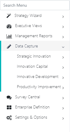
On the left side of the screen, you would see the “Left Navigation Bar” (Figure 7: Left Navigation Bar). This contains the menu structure to access the functionality of the web application and would be the starting point for most navigation. The Menu is laid out in the form of cascading menus and submenus that cascade on clicking the small icon right in front of the same.
Icons And Symbols
The following Icons are used in the application in various places.
ICON
LOCATION
Function
Home
Figure 6: Top Navigation Bar
Brings the application back to the Home page The user can also click the Application Logo on the top left to bring the application back to the home page.
Feedback
Figure 6: Top Navigation Bar
Feedack option is used to send feedback.
Action Item
Figure 6: Top Navigation Bar
Adds a New action Item. Refer Action Items.
Capture Incident
Figure 6: Top Navigation Bar
Adds a New Incident.
Capture Timesheet
Figure 6: Top Navigation Bar
Adds a New Timesheet entry.
Communication Cadance
Figure 6: Top Navigation Bar
Communication Cadence Report (Figure 101: Communication Cadence Report).
Messages
Figure 6: Top Navigation Bar
Takes you to Figure 24: New User Login Credentials
Help & Documentation
Figure 6: Top Navigation Bar
Help and documentation is provide help to users that how to open documentation pages.