PURPOSE
The purpose of Asset Maps and gaps module is to determine and visualise the asset gaps in the Business unit and the enterprise.
ENTERPRISE DEFINITION
Navigation:
Enterprise Definition >> Capabilities >> Asset Framework
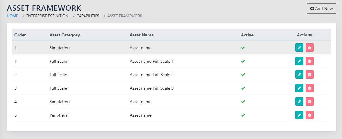
The Asset Framework contains a list of documented knowledge pieces in the organisation as shown in Figure 70: List of Asset Pieces in the Framework. The Asset pieces are categorised as Full Scale, Lab Scale, Simulation, Workshop, operations and Peripheral.
The framework also warns the user when the granularity is too large, i.e. when the number of Asset items is more than 30.
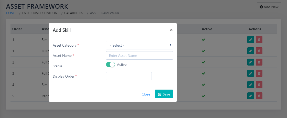
On clicking the icon or clicking the Add new button, the page as shown in Figure 71: Add an Asset to the Framework is presented to the user. The user selects the category from then dropdown and types in the name of the Asset Item. The Sort ID determines the order in which the item appears in the list.
CAPTURE
Navigation:
Data Capture >> Innovation Capital >> Assets
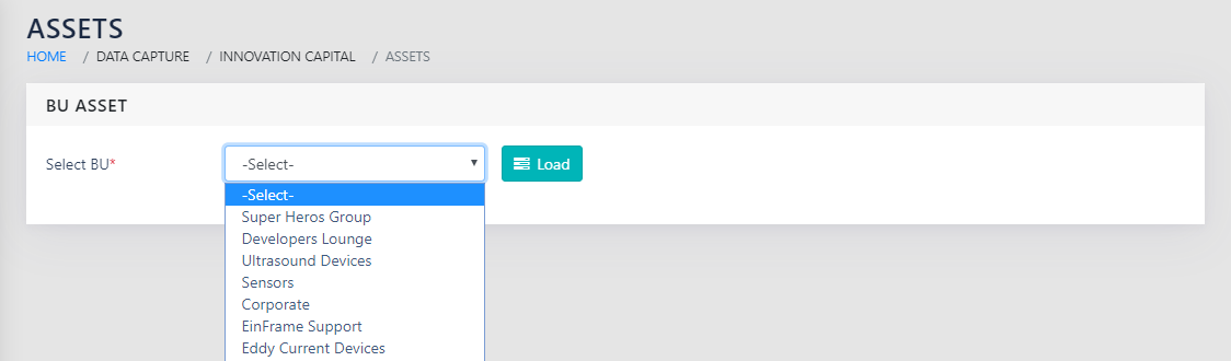
On landing on the page shown in Figure 72: Select BU to capture Asset Needs, you will get a dropdown for all active Business Units. You need to select the Business Unit for which the Asset needs require to be captured.
On selecting enterprise, the application rolls up the data for all active Business Units.
On clicking Load , you land on a page as shown in Figure 73: Update BU Asset Needs. There are five parts to consider in the page.
- The leftmost column is the list of Asset pieces in the system with categorisation.
- The next logical section, to the right of (a) is the number of the individual pieces of Asset in the organisation at each level. This can be from among the five levels, viz.
1-Obsolete 2-Inadequate 3-Just Right 4-Best in Class 5-One of a Kind - The right most column is used for remarks, if any, related to the piece of Knowledge.
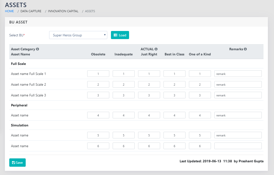
The bottom right of the report ( Last Updated: 2019-04-08 11:47 ) lets the user know when the data was last updated and by whom.
REPORTS
Navigation:
Reports >> Asset Maps & Gaps
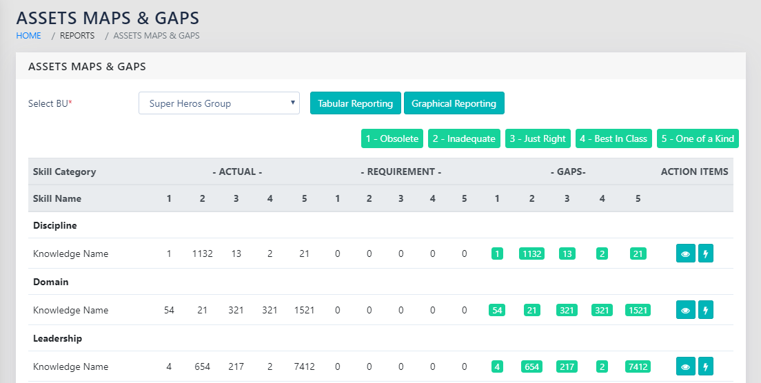
On landing on the page shown in Figure 74: BU and Enterprise Level Asset Map and Gaps Tabular Report, you can select either any of the active Business units or the Enterprise.
On selecting a particular Business Unit, you can choose to show either a tabular or a graphical report.
The requirements for Assets are derived using the data entered in projects. These are an aggregate from all projects that have passed the Start Gate but have not crossed the End Gate.
TABULAR REPORT
The tabular Report, as shown in Figure 61: BU Level and Enterprise level Knowledge Tabular Report, shows the data entered in a table at each level for each Asset item. This also calculates if there are gaps or excesses with respect to an individual asset item. The same is colour coded in Red for Deficit, and Green for excess.
On the right side of the page, you can choose to enter an action item related to the specific piece of Asset. This is enabled using the icon to add action items. The icon shows the remarks entered against the individual line item
The consolidated report of all action items, including the ones entered here, can be seen in Action Items Reports.
GRAPHICAL REPORTS
On clicking the Graphical Reporting button, the user sees the page as show Figure 75: BU Level and Enterprise level Assets Graphical Report. The filled circles represent positive numbers whereas the blank circles represent negative numbers/gaps.
The Graphical report is smart enough to select the most appropriate scaling factor based on the spread of data in the report.
- All the bubbles are sized in proportion to the corresponding value’s ratio to the largest value in the report.
- The diameter of the bubble is proportional to the ratio of the values, if the ratio of the minimum and the maximum absolute value is less than 20. This is to highlight smaller differences. If the ratio of the minimum and maximum value is greater than 20, the area of the bubble is proportional to the values. This makes both the smallest and the largest values clearly visible on the same scale.
This is indicated on the left of the report, along with the legend for scaling.

SPECIAL FEATURES
The framework also warns the user when the granularity is too large, i.e. when the number of Asset items is more than 30.
ROLLS UP TO
Roadmap
OTHER LINKS
Projects