Balanced Score Card
PURPOSE
A balanced score card is a set of Business KPIs that should be maintained within nominal thresholds at all times for a synergistic growth of the business.
Summarise business unit performance on KPIs ready for roll up to the Enterprise.
ENTERPRISE DEFINITION
BUSINESS KPI
Navigaion:
Enterprise Definition >> Internal >> Business KPI
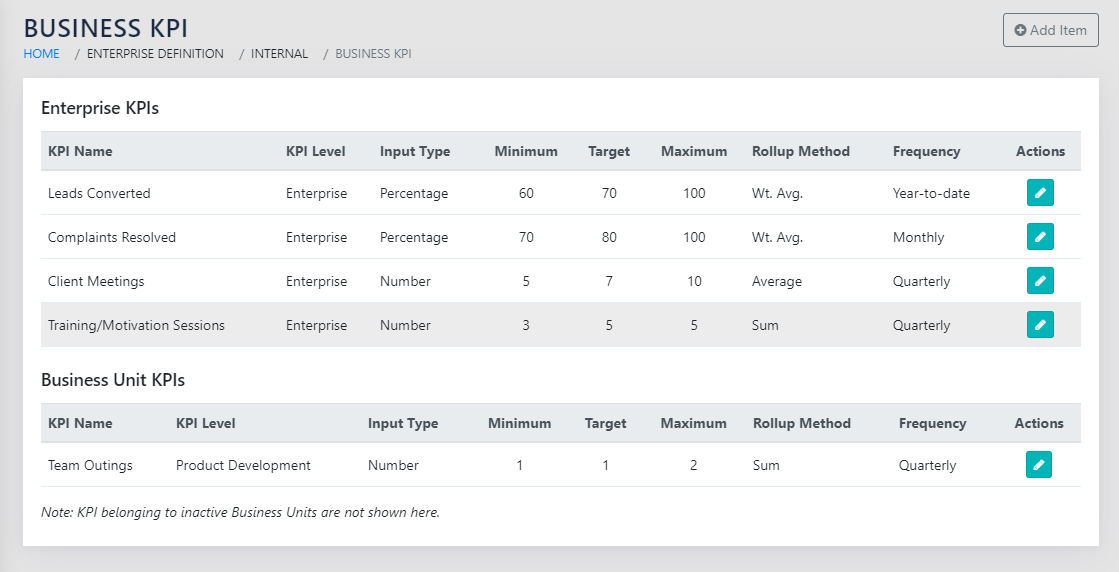
On navigating to the page in Figure 31: List of Business KPIs, you can see all the KPIs that have been defined at either the Enterprise level or at individual BU level.
The Enterprise level KPIs flow down to ALL BUs. Therefore, each BU tracks all the enterprise level Business KPIs and its own specific KPIs.
The table below lists the Business KPI details. These can be edited using the icon on each row. Figure 32: Add Business KPI appears on clicking . The same page opens on clicking Add Item button on the top right of the screen.
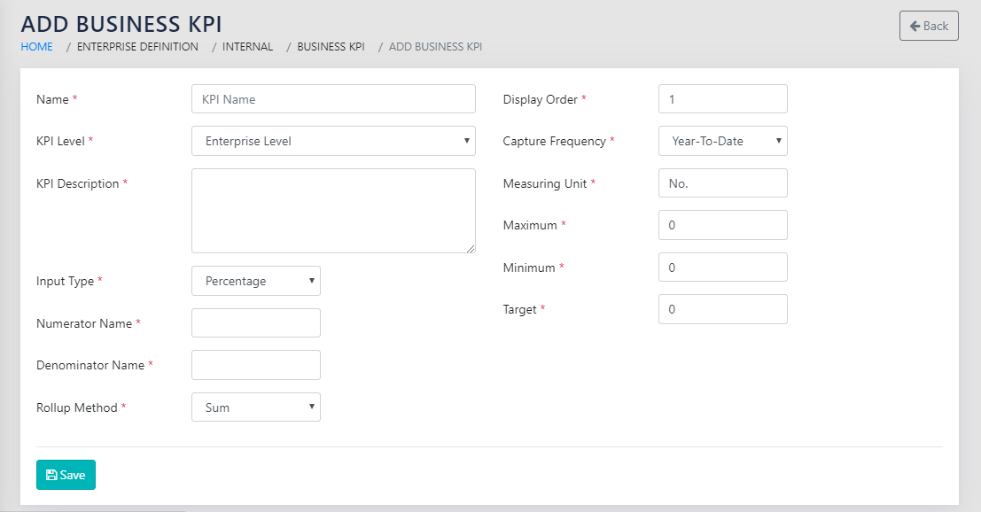
The fields that need to be populated on this page are:
- KPI Name- Free Text- This is a descriptive name for the Business KPI.
- KPI Level- Dropdown- This contains options to select either “Enterprise” or any of the active Business Units. As described above, Enterprise KPIs flow down to all Business Units automatically.
- When Editing the KPI Level, if an Enterprise Level KPI is changed to one of the BUs, a warning appears cautioning that the data for all other BUs that may have used the KPI earlier would be lost.
- KPI Description- Free Text (Optional)- It is a good idea to describe the intent and the interpretation of the business KPI in detail here for reference
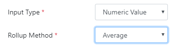
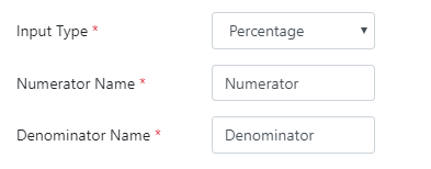
- Input Type: Dropdown: Percentage or Numeric
- If the Input type is numeric, the KPI is a single number and can be rolled up at the enterprise level as a Sum of the Values for all BUs, or as an Average of the Values of all BUs.
- If the Input type is percentage, the rollup type is a ratio (Percentage) automatically. Enter Labels for Numerator and denominator of the ratio so that the percentages can be rolled up automatically.
- Display order- Numeric – This is used for sequencing the display of the KPIs in the Dashboard (Figure 38: BSC Dashboard). You would typically select a display order that groups related KPIs together and arranges those groups in the order of importance.
- Capture Frequency- Dropdown- Choose Between YTD, Monthly and Quarterly
- Units of Measurement- Text- The unit for the KPI
- Minimum- Numeric- The Minimum threshold for the KPI
- Maximum- Numeric- The Maximum threshold for the KPI
- Target- Numeric- The Target for the KPI
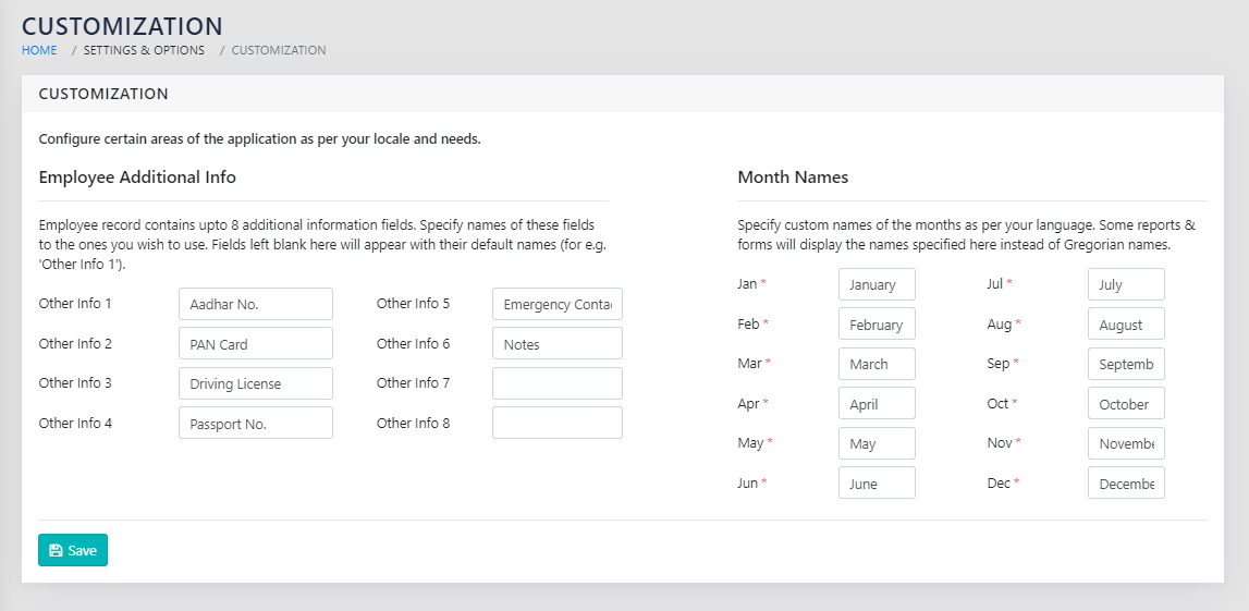
MONTHS/PERIODS
Navigation:
Settings & Options >> Customization
CAPTURE
Navigation:
Data Capture >> Productivity Improvement >> Business KPI Performance
At the given cadence, the user responsible updates the Value for the Business KPI for the respective Business Unit. The user selects the KPI from the page shown in Figure 36: Select Business KPI To Update.
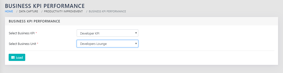
If the user selects an enterprise Level KPI, an option to select a specific business unit is made available. If the User selects a BU specific KPI, the Business Unit is automatically selected by the application. The user then clicks on Load.
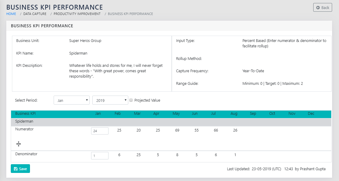
As shown in Figure 37: Update the Business KPI, The current period is automatically selected and editable. In case of a percentage type KPI, enter both numerator and the denominator. In case of a simple Numeric KPI, enter the value of the KPI.
The user has the option to fill the data of the KPIs based on projections. For this, the user must check the
 checkbox. This is useful for projecting the data in the near future before the actual data is available.
If you want to update the values for the periods other than the current period, select the period from the dropdown on the right above the table ( ). Please note that these names are populated from the names of the periods saved using the screen shown in Figure 35: Enter the name of Months/Periods.
BALANCED SCORE CARD DASHBOARD
Navigation:
Executive Views >> Dashboard >> Balanced Score Card
We have facility for seeing the Enterprise level data as cards, with colour coding, and a facility to drill down into details with one click, KPI wise., There is a line graph representation on demand to visualise trends. The KPIs above or below the limits are in RED whereas the KPIs within Limits are in GREEN. If some of the source data is missing, an asterix (*) appears next to the value. If no data is available for the KPI, a dash (-) appears in the place of the value. This is as shown in Figure 38: BSC Dashboard. The report can be filtered by month and by the names of the Active Business Units. By default, the Dashboard opens at the month for which the data is supposed to be updated (typically the previous month) and for the Enterprise.
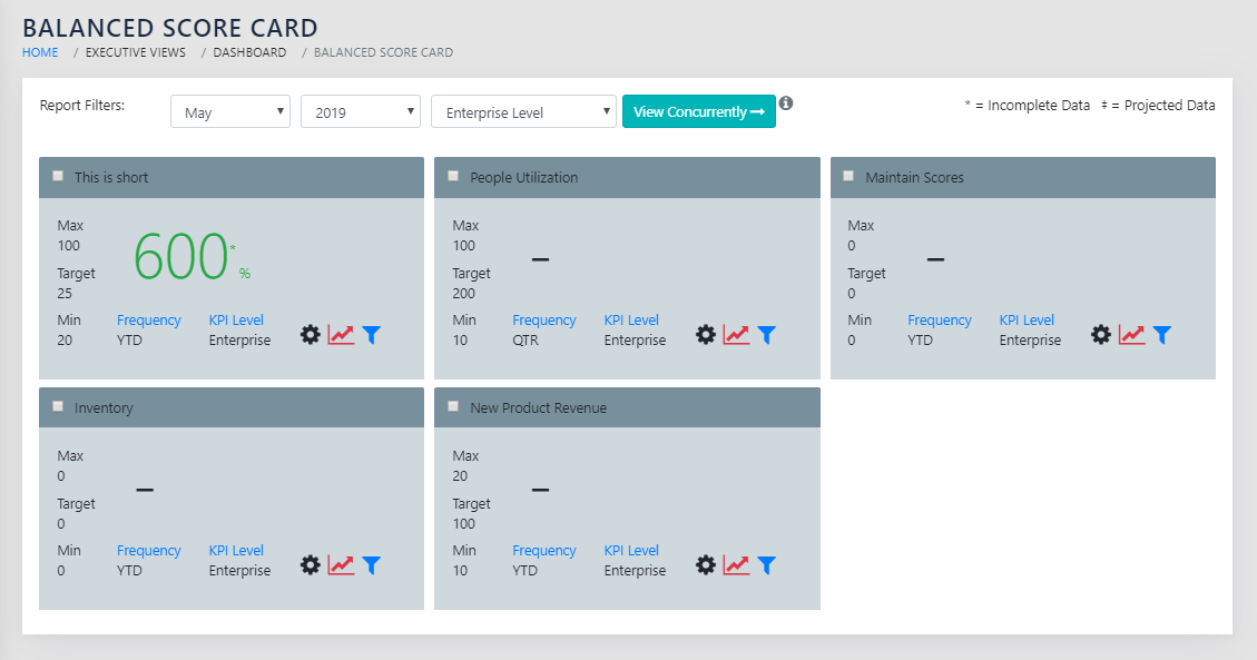
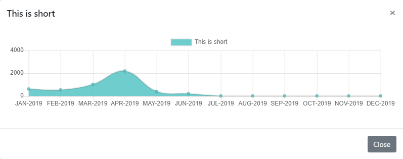
On clicking the icon on any of the cards, a line graph similar to “Figure 39: Graphical View of a Business KPI over Time” appears on the screen. Projected data is shown separately as a small square data point. ( ).
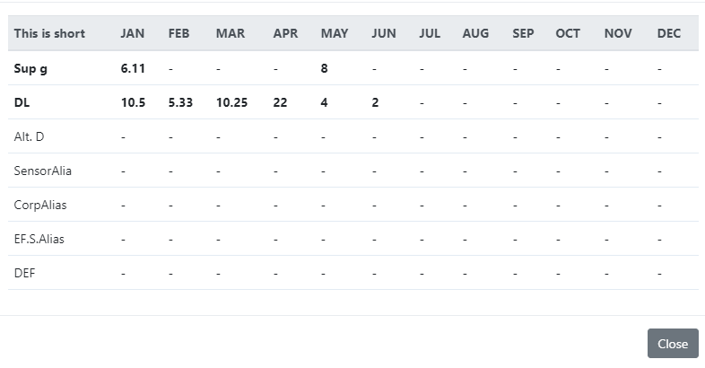
On clicking the icon on any of the cards, BU wise time series data is available for the particular KPI as shown in “Figure 40: Tabular View of a Business KPI over Time Broken Down by Business Units”. This facilitates drilling down into individual BU performance.

If the report is filtered a Business Unit, the data for the same is displayed in BOLD in the filtered report, as shown in Figure 41: BSC dashboard, detailed data drill down with BU selected.
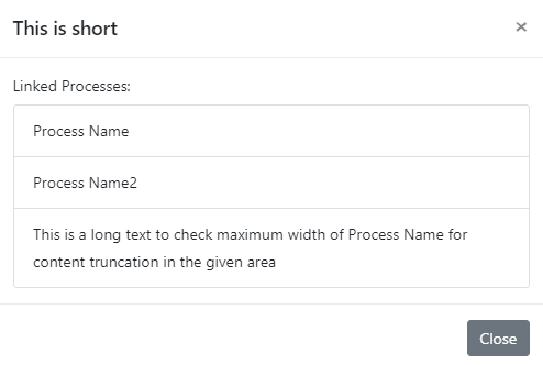
On clicking the icon on a card, the processes linked to that KPI are shown to the user.
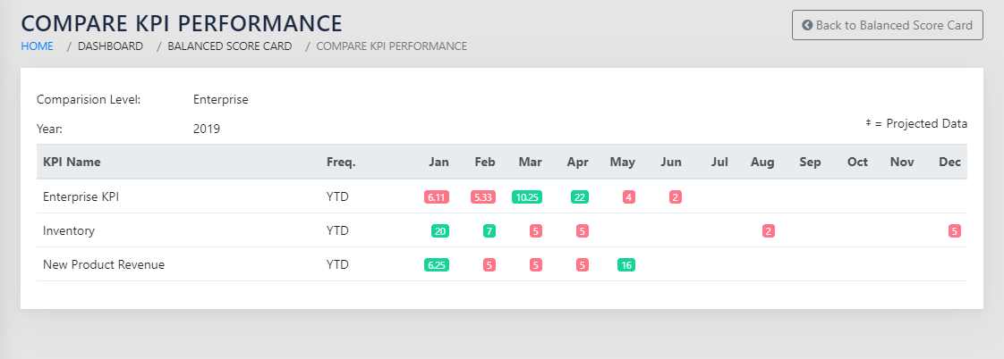
COMPARE KPIS VIS-À-VIS PERIOD
The KPIs can be compared to each other to spot relative movement over time. This balances the actions that have been taken to control any out of limit KPIs in the past.
To compare the KPIs, select the KPIs using the checkboxes on the KPI cards on the dashboard, as shown in Figure 38: BSC Dashboard. This can be done either at the Enterprise level, or at a BU level. On clicking the View Concurrently button, you are taken to the screen shown in Figure 43: Compare KPI Performance. Here you can see the data in the form of a Heat-mapped Table, with out of bounds KPIs highlighted in RED , and within limits KPIs highlighted in GREEN.
This shown the data for the last 3 periods going back from the date selected in the date filter shown in Figure 38: BSC Dashboard.